.png)
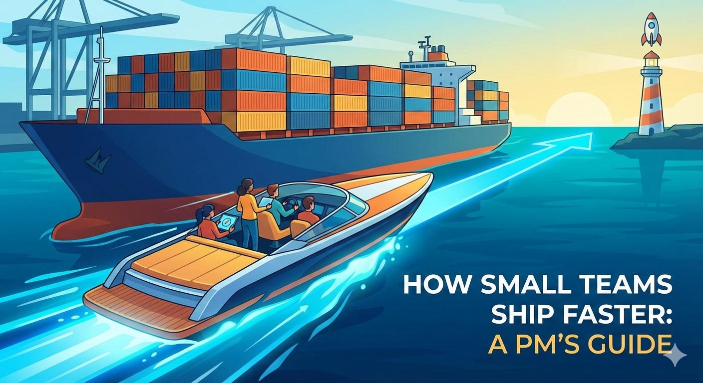
TL;DR: Most landing page optimization advice focuses on button colors and headline tweaks. Those matter, but they're not what moved our conversion from 5% to 65%. The real shift was understanding that visitors arriving from search don't want to learn about your product—they want to do the thing they searched for. When we redesigned pages around "do the thing first, pitch second," conversion transformed. The visitor proves interest by using your tool; you prove value by delivering results before asking for anything.
Why Do Most Landing Pages Convert Poorly?
Most landing pages convert poorly because they're designed around what the company wants to say, not what the visitor wants to do.
The typical landing page follows a predictable structure: hero section explaining the product, features list, social proof, pricing, and a call-to-action asking visitors to sign up or start a trial. This structure assumes visitors arrived wanting to learn about your product and just need convincing.
For most organic and paid traffic, that assumption is wrong.
What's wrong with the "pitch first" approach
When someone searches "background remover" and lands on your page, they're not thinking "I wonder what Picsart is." They're thinking "I need to remove this background." They have a job to do. Your pitch is interrupting them.
The pitch-first approach creates friction at the exact moment when friction is most costly—the first few seconds when visitors decide whether to stay or bounce.
Every second spent explaining who you are is a second the visitor isn't getting what they came for. By the time you've made your case, they've already left for a competitor who let them start immediately.
Why intent mismatch kills conversion
Search traffic comes with built-in intent. Someone searching "resize image for Instagram" has a specific task. Someone searching "best photo editing app" is in research mode. These are fundamentally different visitors requiring fundamentally different pages.
The mistake is treating them the same.
When we analyzed our underperforming pages, the pattern was clear: pages that converted well matched the visitor's intent immediately. Pages that converted poorly made visitors work to find what they came for.
Intent mismatch isn't a copywriting problem. It's an architecture problem. No amount of better headlines will fix a page designed for the wrong visitor journey.
What's the "Tool-First" Approach and Why Does It Work?
The tool-first approach means putting a functional tool at the top of your landing page—above the fold, before any marketing copy—so visitors can start doing the thing they came to do immediately.
For a background remover page, that means an actual background remover. Upload your image, see the result, download it. No signup required. No pitch first.
This felt counterintuitive when we first tested it. Why would anyone sign up if they already got what they wanted for free? Wouldn't we just give away value without capturing it?
The opposite happened.
How giving value first increases conversion
When you deliver value before asking for anything, you accomplish several things simultaneously:
You prove competence. The visitor doesn't have to trust your marketing copy. They've seen your tool work on their actual image.
You create reciprocity. You gave them something valuable. Now they're more inclined to give you something back (their email, their attention, their payment).
You reduce perceived risk. Signing up for something untested feels risky. Signing up for something you've already used feels safe.
You filter for quality. Visitors who use the tool and then sign up are genuinely interested. Visitors who just wanted a quick fix leave satisfied but don't clog your funnel with low-intent signups.
The psychology is simple: people trust what they've experienced more than what they've been told.
What this looks like in practice
Here's the structure that worked for our acquisition landing pages:
- Tool interface at the top. The first thing visitors see is a way to start using the tool. Drag-and-drop upload, immediate processing, instant results.
- Contextual upsell after value delivery. Only after the visitor has received value do we ask for anything. "Want to edit this further? Open in Picsart." The ask is connected to what they just did.
- Supporting content below the fold. Feature explanations, use cases, and FAQs exist for visitors who want them—but they're not blocking the primary action.
- Minimal friction to download. Let them get their result. The conversion happens on the upsell or the return visit, not by gating the immediate value.
This structure inverts the typical landing page. Instead of "convince then convert," it's "deliver then deepen."
What Specific Tactics Actually Moved the Numbers?
Not everything we tested worked. Here's an honest breakdown of what moved conversion and what didn't, despite seeming like good ideas.
What worked
Tool-first layout (biggest impact). Moving the functional tool above the fold—before any marketing copy—was the single largest improvement. Conversion roughly doubled from this change alone. The visitor could start their task in under 3 seconds.
Contextual upsells tied to completed actions. Instead of generic "Sign up for Picsart" CTAs, we showed "Want to edit this further? Continue in Picsart" after they'd used the tool. The prompt was relevant because it extended what they'd just done.
Aggressive page speed optimization. We obsessed over load time. Pages loading in 1.5 seconds converted measurably better than pages loading in 3 seconds. For utility searches, visitors have zero patience. Every additional second of load time cost us conversions.
Removing elements we thought were necessary. We A/B tested removing feature explanations, comparison tables, and lengthy social proof sections. In most cases, simpler pages with less content converted better. The tool was the proof; extra content was distraction.
Single clear action per page. Pages with one obvious thing to do outperformed pages with multiple options. A background remover page removes backgrounds. It doesn't also offer cropping, filtering, and text overlay. Focus beats flexibility.
Mobile-first design. Over 60% of our traffic was mobile. Pages designed for desktop and "adapted" for mobile underperformed pages designed mobile-first. The upload flow, the results display, the download button—all needed to work flawlessly on a phone.
What didn't work (despite seeming like good ideas)
Video explainers. We invested in professional videos explaining how the tools worked. They increased production cost, slowed page load, and didn't improve conversion. People didn't want to watch—they wanted to do.
More options and features. We tried offering multiple related tools on one page (background remover + image resizer + format converter). Conversion dropped. Choice creates friction. Visitors got confused about where to start.
Trust badges and client logos. We added "As seen in..." logos and security badges. No measurable impact. For utility tools, the product is the trust signal. Logos felt irrelevant to the task at hand.
Long-form sales copy. We tested detailed pages explaining benefits, use cases, and differentiators. They converted worse than minimal pages with just the tool. The visitors arriving from search didn't need convincing—they needed the tool.
Exit-intent popups. We tested popups offering discounts or lead magnets when visitors tried to leave. Slight improvement in email capture, but the emails were low quality and the experience felt desperate.
Social proof below the tool. Adding testimonials and user counts below the tool interface had no impact. By that point, visitors had either converted or left. Social proof that doesn't prevent bounces doesn't help.
How Do You Measure and Iterate on LP Conversion?
Conversion rate is the headline metric, but it's not the only thing that matters. A page that converts 80% of visitors into free users but 0% into paying customers isn't actually performing well.
What metrics matter beyond conversion rate
Conversion rate by source. Organic search visitors behave differently than paid ad visitors. Email traffic converts differently than social. Blending them into one number hides important patterns.
Downstream conversion. What percentage of landing page conversions become activated users? Paying customers? High LP conversion with low downstream conversion often means you're attracting the wrong visitors or overpromising.
Time to value. How quickly do visitors get their result? We tracked time from page load to successful download. Reducing this consistently improved both satisfaction and conversion.
Bounce rate with context. High bounce rate isn't always bad. If visitors get their result and leave satisfied, they might return. If they bounce in 3 seconds, that's different. Segment bounce rate by time on page.
Return visitor conversion. What percentage of visitors who didn't convert on first visit come back? Strong tool-first experiences generate return visits. Visitors remember you solved their problem.
How to run tests without enough traffic
Most A/B testing advice assumes you have enough traffic to reach statistical significance quickly. If you're not Google, you probably don't.
Test bigger changes, not micro-optimizations. Button color tests take millions of visitors to show significance. Layout changes show significance faster because the effect size is larger. Test big swings.
Use sequential testing. Instead of splitting traffic 50/50, run version A for a week, then version B for a week. More prone to external factors, but requires less total traffic.
Combine quantitative with qualitative. Watch session recordings of both variants. Ten recordings often reveal more than a statistically insignificant conversion lift. You'll see where people get stuck.
Accept more uncertainty. Not every decision needs p<0.05 confidence. If version B looks 20% better with p=0.15, you might ship it and keep monitoring. The cost of indecision is often higher than the cost of being wrong.
Test on highest-traffic pages first. Focus optimization energy where it has the largest absolute impact. A 10% improvement on a page with 100K visitors matters more than a 50% improvement on a page with 1K visitors.
How Does This Apply to Different Types of Landing Pages?
The tool-first approach works best for acquisition landing pages with high-intent traffic. It doesn't work everywhere.
When this approach works well
Utility tools and single-purpose products. Background removers, file converters, calculators, generators. Anything where the visitor has a clear task and wants to complete it immediately.
Freemium SaaS with a clear core action. If your product has an obvious "try it now" moment that doesn't require setup, lead with it. Let visitors experience value before creating an account.
Content upgrade landing pages. If you're offering a downloadable resource, show a preview or summary first. Prove the content is valuable before gating it.
E-commerce with immediate utility. Product customizers, size calculators, style quizzes. Anything that helps the visitor make progress toward their goal while generating data for you.
When this approach doesn't work
Complex B2B products requiring context. If your product needs explanation before it makes sense, tool-first doesn't work. You can't put a "try our enterprise data platform" widget at the top of the page.
High-consideration purchases. Expensive products where visitors need information before making decisions. A landing page for $10K software needs to educate, not just demonstrate.
Brand awareness campaigns. If the goal is familiarity rather than conversion, storytelling matters more than immediate utility.
Regulated industries. Financial services, healthcare, legal—industries where compliance requirements mean you can't let visitors "just start using" something.
The principle still applies in translation: understand what the visitor actually wants to do, and make that possible as quickly as your context allows. For a utility tool, that's instant. For B2B enterprise, that might be "schedule a call in 2 clicks."
What's Changed About LP Optimization in 2025?
Landing page optimization in 2025 is faster to execute and harder to stand out with. AI has changed both the tools and the expectations.
How AI tools change the testing process
Copy generation at scale. You can now generate 50 headline variations in minutes. The constraint isn't writing them—it's testing them and interpreting results.
Design iteration without designers. Tools like Midjourney, Figma AI, and various landing page builders let you prototype visual variations without waiting for design resources.
Personalization becomes accessible. AI-powered personalization that adapts content to visitor segments used to require enterprise budgets. Now startups can implement basic personalization with off-the-shelf tools.
Analysis acceleration. AI can summarize session recordings, identify patterns in user feedback, and suggest hypotheses based on data patterns. The insight bottleneck is shifting from "extracting patterns" to "deciding what to act on."
Coding assistance. Implementing tests that used to require engineering support can now be prototyped with AI coding assistants. PMs can validate ideas before consuming dev resources.
The result: the cycle time from hypothesis to test to learning has compressed dramatically. Teams that used to run 4 tests per quarter can now run 4 tests per month.
What's different about user expectations now
Patience has decreased. Users exposed to instant AI results expect everything to be fast. A page that loads in 3 seconds feels slow when ChatGPT responds in 1 second.
Skepticism has increased. Users are better at pattern-matching marketing tactics. The same social proof and urgency mechanisms that worked in 2020 now feel manipulative. Authenticity matters more.
Comparison is easier. Users can ask AI "what's the best free background remover?" and get instant comparisons. You're not just competing for clicks—you're competing for AI recommendations.
Attention spans are more fractured. Multi-tasking, notification interruptions, and shorter-form content have trained users to make decisions faster. Your page has fewer seconds to earn engagement.
The bar for conversion has risen. Good enough in 2020 underperforms in 2025.
What Can Growth PMs Learn From This Beyond Landing Pages?
The principles behind high-converting landing pages apply to product growth more broadly.
Lesson 1: Meet users where they are, not where you want them to be
Landing pages convert when they align with visitor intent. Products grow when they align with user motivation. Both require understanding what someone actually wants to do and making that easy—not trying to redirect them to what you want them to do.
This applies to onboarding flows, feature adoption, retention campaigns, everything. Start with the user's goal, not your goal.
Lesson 2: Prove value before asking for commitment
The tool-first approach is really "value-first" applied to a specific context. Wherever you're asking users for something—signup, payment, attention, effort—ask yourself whether you've earned that ask by delivering value first.
Free trials, freemium models, content marketing—they all work on this principle. Give before you ask.
Lesson 3: Simplicity usually wins
Most of our losing tests added something. Most of our winning tests removed something. Complexity feels like value when you're building. Complexity feels like friction when you're using.
Default to simpler. Add complexity only when evidence demands it.
Lesson 4: Test the architecture, not just the details
Button colors and headline tweaks are easy to test but rarely transformative. Layout changes, flow redesigns, and structural decisions have larger effect sizes. They're harder to test but more worth testing.
If you're optimizing for months without breakthrough results, you might be testing the wrong layer.
Lesson 5: What works is often counterintuitive
Our best insight—give away the value for free before asking for anything—violated what felt like common sense. Trust your data over your intuition. The market doesn't care what seems logical; it cares what works.
Key Takeaways
- Most landing pages convert poorly because they're designed around what the company wants to say, not what the visitor wants to do
- The tool-first approach puts functional utility above the fold—let visitors start immediately, pitch second
- Giving value before asking creates proof, reciprocity, and filtered intent
- What worked: tool-first layout, contextual upsells, aggressive speed optimization, simplification
- What didn't: video explainers, more options, trust badges, long-form copy, exit popups
- This approach works best for utility tools and high-intent traffic; complex B2B needs adaptation
- AI tools in 2025 compress the test-and-learn cycle but also raise user expectations
- The deeper lesson: meet users where they are, prove value before asking, and default to simpler
FAQ
What conversion rate should I be targeting?
Industry medians are around 2-5% for most landing pages, with top performers hitting 10%+. But the "right" target depends on your traffic source, product, and what counts as conversion. A 65% conversion rate on a free tool is different from 65% on a paid product. Focus on improving your own baseline rather than hitting an arbitrary benchmark.
How do you balance giving value for free with capturing leads?
The balance is in timing and context. Give the core value freely—don't gate the thing they came for. Capture leads on the upsell (enhanced features, saved work, continued editing) rather than on initial access. Users who convert after receiving value are higher quality than users who convert to receive value.
What if my product doesn't have an obvious "try it now" moment?
Find the smallest unit of value you can deliver quickly. For complex products, that might be a calculator, assessment, or personalized recommendation rather than the full product. The goal is proving competence and creating engagement, not demonstrating every feature.
How long should I run an A/B test before deciding?
Until you have statistical significance or a business need to decide. For most pages, that's 2-4 weeks with meaningful traffic. If you don't have enough traffic, test bigger changes with larger effect sizes, or accept more uncertainty in your decisions. Waiting forever for perfect data has its own cost.
Does this approach work for B2B landing pages?
The principle (match intent, prove value quickly) applies, but the execution differs. B2B visitors often can't "use the product" in 30 seconds. Focus on the fastest way to prove relevance: a quick assessment, ROI calculator, or personalized demo booking. The goal is still reducing friction between intent and value.

.png)
.png)
.png)