What ScreenshotEdits is teaching me about workflow-first product design
ScreenshotEdits keeps reinforcing one product lesson: narrow workflow pain, visible before-after value, and clear proof beat another broad AI feature pile.
 Niels Kaspers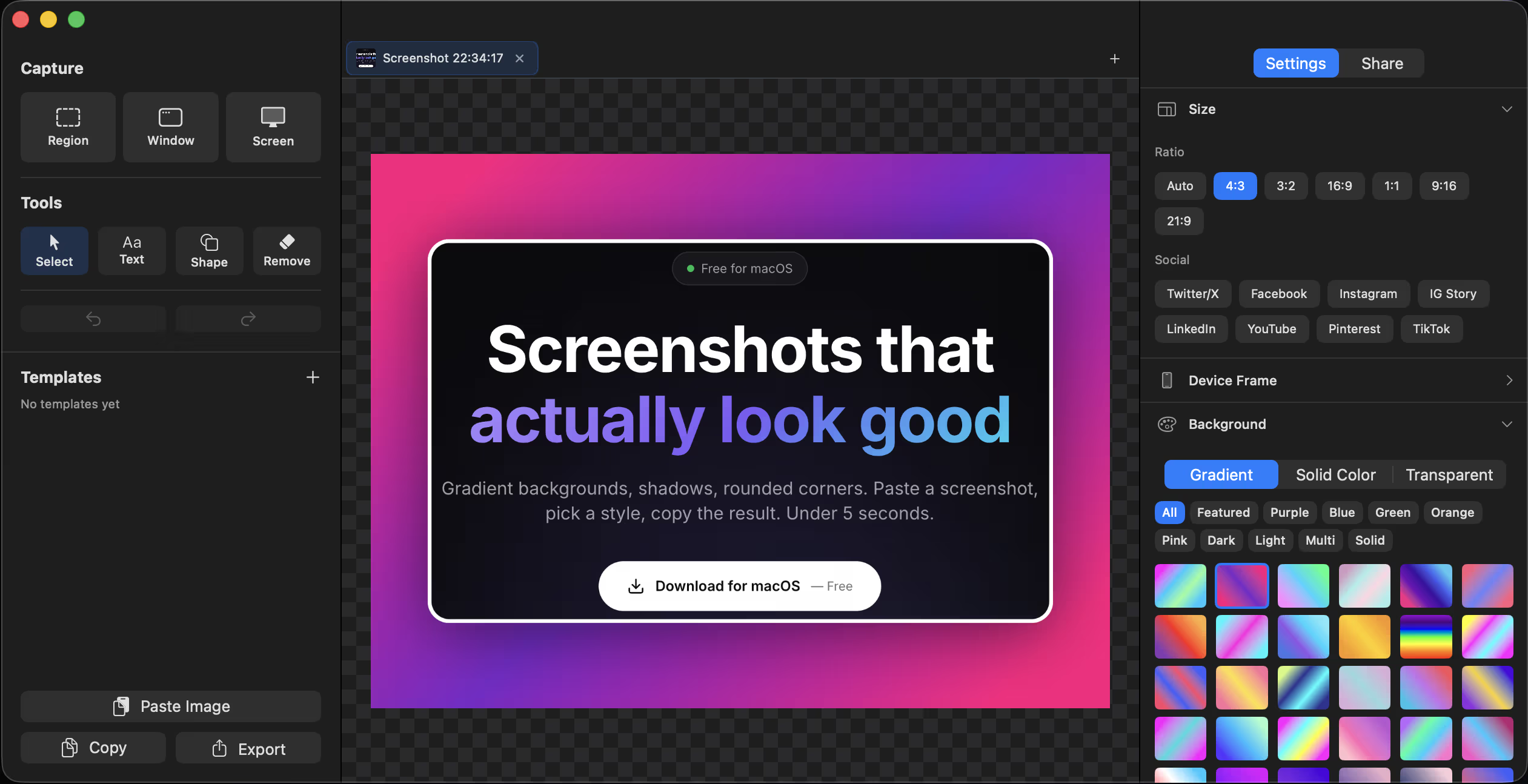
TL;DR
ScreenshotEdits only got sharper when the product stopped trying to be a general design utility and leaned harder into one repeated workflow: turning ugly raw screenshots into presentable assets fast. That workflow-first lens shaped the product, copy, proof layer, and surrounding content more than any feature checklist could.
The more I work on ScreenshotEdits, the less I believe small products win by sounding broader.
They usually win by solving one ugly repeated workflow cleanly enough that the user can feel the difference in under a minute.
That has been the real product lesson here.
ScreenshotEdits is not interesting because it tries to become a giant design suite. It gets interesting when it stays narrow: take a plain screenshot, make it presentable fast, and remove the little formatting tax that keeps showing up in docs, launch posts, landing pages, changelogs, and demos.
That is what I mean by workflow-first product design.
The product starts with a repeated job, not with a giant category ambition. The interface, proof, copy, and surrounding content all get simpler because the workflow is easier to name.
And in a market full of AI wrappers, feature stacks, and generic productivity claims, I trust that shape more than breadth.
Why this feels more relevant right now
The interesting July 17 to July 18, 2026 operator chatter was not really about one more model launch.
It was about friction.
One post described the "shadow AI" problem as a governance gap created by rigid official workflows and scattered consumer-tool usage. Another described different AI coding tools reading different versions of the same instructions. The common theme was not capability shortage. It was workflow drag.
That is useful outside agent systems too.
It is a reminder that people do not adopt products because the category got louder. They adopt products because a specific repeated job still feels annoying enough to deserve its own tool.
That is also why I think workflow-first products have a better chance of staying legible. When the job is narrow and visible, the product has an easier time explaining itself to users, search systems, and even browser agents that need a clear interface to act through.
Google's current AI optimization guide keeps making the same broader point from the content side: useful, non-commodity surfaces win when their purpose is clear. web.dev's Build agent-friendly websites and Chrome's agent-ready toolkit point the same direction from the interaction side: stable, semantic, legible flows matter more than novelty theater.
Workflow-first product design is the product version of that same rule.
The job ScreenshotEdits is actually solving
A lot of screenshot tools describe themselves too generically.
They talk about visuals, polish, branding, presentation, content, and design quality all at once.
Those ideas are not wrong.
They are just one step too abstract.
The real repeated job is much simpler.
You have a screenshot that is functionally correct and visually annoying.
Maybe the raw image has the default gray background. Maybe the edges feel harsh. Maybe the screenshot looks fine in isolation and bad the second you drop it into a post, a doc, or a launch thread.
That is the moment the workflow breaks.
You can open Figma. You can open Photoshop. You can do nothing and ship the ugly image. Or you can use a narrower tool built for that exact cleanup step.
That is why ScreenshotEdits works better as a product story when the promise stays specific.
It is not trying to be a full design environment.
It is trying to remove one repeated piece of visual friction.
That is a much stronger product sentence.
Workflow-first design starts with repeated pain, not feature ambition
The main trap in small product design is building from the inside out.
You know what you can technically add, so the roadmap starts to sound like a catalog.
More templates.
More export options.
More styles.
More AI.
More everything.
That is how a product gets harder to position.
A workflow-first product usually moves the other direction.
It asks:
- where does the user lose time in a repeated task
- what ugly manual step keeps showing up right before something gets published or shared
- what is the smallest product surface that removes that step cleanly
- what proof would make the value obvious fast
That is the same lesson behind What building PDFTry taught me about category positioning. The product got sharper once the promise stopped trying to sound complete and started sounding specific.
PDFTry got stronger when the trust promise became "your files stay in the browser."
ScreenshotEdits gets stronger when the workflow promise becomes "make screenshots look publishable fast."
The category stays broad in the background.
The workflow stays narrow in the foreground.
Before-after proof matters more when the workflow is visual
One reason workflow-first products can stay small longer is that the proof layer becomes easier to see.
ScreenshotEdits does not need a giant conceptual argument first.
The user can understand the value by looking.
That changes how I think about both the product and the supporting content.
If the workflow is visual, the proof should be visual.
If the workflow is fast, the copy should not overcomplicate the promise.
If the value happens in the last formatting mile before something gets published, the surrounding pages should meet the user near that job instead of describing the product in generic creator-tool language.
That is why I still think Why your product page needs a context layer, not just a feature grid matters here. The product page should not carry the whole educational burden alone. The surrounding surface should help explain when polished screenshots matter, where they fit in a builder workflow, and why a narrow native tool can beat a broader design detour.
Narrow workflow products are easier to route through a site
Another thing I like about workflow-first products is that the content system gets clearer.
A vague product usually creates vague surrounding content.
A narrow product creates cleaner routes.
With ScreenshotEdits, the obvious supporting surfaces are things like:
- build notes about workflow-first product design
- founder essays on small-product leverage
- product-page context around when better visuals matter
- adjacent content on docs, demos, launch assets, and distribution surfaces
Those pages reinforce the same promise instead of inventing random adjacent traffic ideas.
This is also why the site architecture matters so much more now. If a user lands on a founder essay first, the product page should feel like the natural next step. If they land on the product page first, the surrounding writing should deepen the logic behind the product instead of repeating the tagline.
That routing layer is part of the product, not just a marketing afterthought.
Workflow-first products resist AI sameness better
I do not think AI makes narrow products less important.
I think it makes them more important.
When output gets cheaper, the market fills with products that sound broad, flexible, and vaguely magical.
That is exactly when a product needs a more grounded reason to exist.
A workflow-first product has one built-in advantage here.
It does not need to win the abstract intelligence contest.
It only needs to solve a repeated job in a way that feels lighter, faster, or more trustworthy than the old workaround.
That is a much more defensible standard.
It also keeps the product honest. If the workflow is not actually better, the product cannot hide behind a giant category story for long.
That is the same reason I have become more skeptical of bloated AI positioning. A lot of those products still have to earn the right to exist at the workflow level first.
The product surface should stay aligned with the workflow sentence
Once the workflow sentence is clear, a lot of design decisions get easier.
For ScreenshotEdits, that means the product should keep reinforcing speed, clarity, and visible transformation.
The interface should not feel like a design maze.
The feature list should not pretend the product is a general-purpose creative suite.
The proof should not rely on a wall of abstract benefits.
The user should be able to infer quickly:
- what goes in
- what gets better
- how fast it happens
- whether the result is good enough to use immediately
That is also where agent-friendly and semantic design guidance becomes surprisingly relevant. The clearer the flow, the easier it is for humans to use and for machines to understand. That is not only a browser-agent issue. It is a product-legibility issue.
The product that explains itself well usually gets more leverage from every surrounding channel.
What I would keep resisting
The temptation from here is obvious.
Add more features until the product can claim a larger category.
Sometimes that is right.
A lot of the time it weakens the product before it strengthens it.
I would resist three things first.
1. Feature breadth that weakens the core sentence
If a new feature makes it harder to explain the product in one line, I would be suspicious.
2. Category language that hides the workflow
If the copy starts sounding like a generic design or creator utility, the product is losing its best proof layer.
3. Supporting content that chases traffic without reinforcing the job
The surrounding content should help the workflow sentence travel. If it only adds surface area without making the product clearer, it is noise.
The audit I would use on a product like this
Interactive
Workflow-first product audit
Use this before broadening a small product into a blurrier category play.
Completion
This is the gap between understanding the article and actually using it.
- Use this block as the practical summary, not just the article ending.
- If one item feels vague, the article probably needs sharper guidance.
- A short checklist beats a long recap when the reader needs to act.
My broader take
Building ScreenshotEdits keeps reminding me that product design gets easier when the workflow stays visible.
The more specific the repeated pain, the easier it is to shape the product, explain the value, and build the right surrounding surface around it.
That does not make the product smaller in a bad way.
It usually makes it stronger.
Small products do not need to sound infinite.
They need to make one repeated job feel obviously lighter.
That is what I trust more than another broad feature pile.
FAQ
What is workflow-first product design?
It is a product-design approach that starts with one repeated user job and shapes the interface, proof, and surrounding content around removing that friction cleanly.
Why does ScreenshotEdits fit this idea?
Because the value is narrow and visible. The product removes one repeated visual cleanup step that shows up in docs, launches, posts, and demos.
Is workflow-first product design only for small products?
No, but it is especially useful for small products because it keeps the positioning and roadmap clearer while the product is still earning trust.
How does this connect to AI-era product building?
When AI makes categories noisier and output cheaper, workflow clarity becomes more valuable. Products that solve one repeated job cleanly are easier to understand and harder to flatten into generic hype.
What is the biggest mistake workflow-first products make?
They broaden too early. The roadmap starts chasing feature breadth before the original workflow sentence has fully earned the right to expand.