How to use product screenshots as proof, not decoration
Use product screenshots as decision evidence: show the user job, meaningful state change, and proof buyers need before choosing your product.
 Niels Kaspers
TL;DR
A product screenshot earns its place when it answers a buyer's next question: what changes, where it happens, and why that state is credible. Treat it as a small proof block with a claim, a visible moment, and just enough context to interpret it.
Most product screenshots are decorative because they arrive after the copy has already made the claim. A useful product screenshot does a harder job: it lets someone inspect the claim before they have to trust it.
If your page says a workflow is faster, private, collaborative, or easier to understand, show the relevant moment in that workflow. A polished UI crop with no task or state is branding, not evidence.
The practical standard for product screenshots is simple: every image should answer one buyer question that the surrounding words cannot answer as quickly. Show the job, the meaningful state change, and the boundary that makes the claim believable.
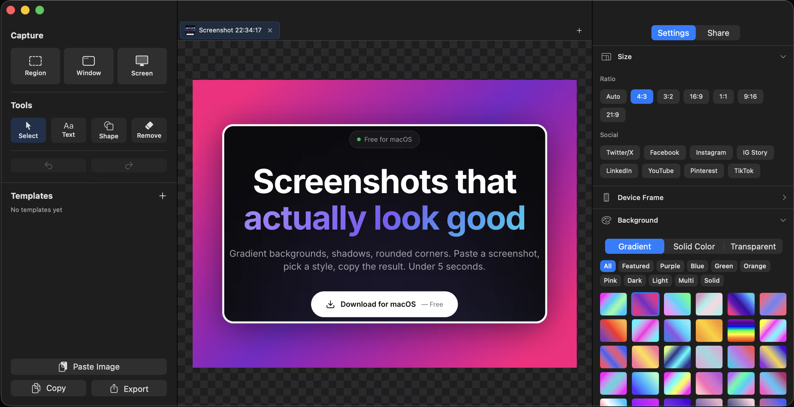
I keep running into this while building ScreenshotEdits, a native macOS tool for turning raw screenshots into publishable visuals. It only works when a visitor can see the before-and-after outcome. The same is true of a PM workflow, browser-local privacy promise, or AI feature: the visual needs to make a decision easier.
Baymard's product-image research makes the broader point well. Its usability testing found people often inspect imagery before description text, while images and text each leave different information gaps. That does not mean every SaaS page should copy an ecommerce gallery. It means visual proof and explanatory copy need to carry the decision together.
Start with the question the screenshot must answer
Do not begin with the prettiest screen. Begin with the hesitation that is stopping a person from moving forward. Most screenshots on a product page should answer one of five questions:
- What does the user actually do here? Show the trigger, input, or first meaningful action.
- What changes after the product does its work? Show an outcome, not a menu full of possibilities.
- Can I understand the result at a glance? Use a state that makes the difference legible without a guided tour.
- Where is the trust boundary? If privacy, review, or human control matters, make that boundary visible.
- Will this fit my situation? Use context, scale, or a realistic example rather than an abstract empty state.
A blank dashboard rarely answers any of them. It shows that an interface exists. It does not show why it deserves a place in someone’s workflow.
For PDFTry, the relevant visual proof is not a generic settings screen. The important proof is the browser-local workflow and the fact that a person can complete a sensitive document job without creating an upload step. For a product feature, the equivalent may be a reviewed decision, a resolved exception, or an output that is ready to use.
Give every image a claim, a moment, and context
A durable screenshot block has three layers.
1. A claim
State the specific thing a person should be able to verify. Avoid labels such as “beautiful interface” or “powerful automation.” Say what changed: “Turn a raw capture into a presentation-ready visual without opening a design tool,” or “Review the exception before an automated workflow takes action.”
2. A moment
Pick the screen state that makes the claim observable. That may be an input beside an output, a progress state, a decision record, or a visible confirmation. The moment matters more than whether the entire application is visible.
3. Context
Add the minimum explanation necessary to prevent the viewer from inventing the wrong story. A short caption, callout, or nearby sentence is often enough. Baymard notes that descriptive text or graphics can bridge what an image alone and a description alone fail to communicate.
This is why product screenshots should not be handed off as the final cosmetic step. They are part of the product argument. The screenshot choice exposes whether the team can name the user job and the evidence needed to support it.
Make the proof legible on the smallest screen
A desktop screenshot filled with tiny annotations can look persuasive in a design review and fail completely in a mobile feed. Baymard's gallery-navigation guidance is a helpful reminder: important visual information needs to be discoverable, not merely present somewhere in a gallery.
Use these rules when preparing a visual proof block:
- crop to the decision, not the entire application window
- use one focal change per image
- keep text large enough to survive a narrow viewport
- pair the image with a plain-language claim outside the image itself
- show a believable state, not a fake wall of perfect data
- expose sensitive information only after redaction or safe test-data replacement
The last point matters for screenshots from research or customer workflows. GOV.UK's guidance on sharing research findings recommends a relevant screenshot or participant quote as part of a useful finding, while its privacy guidance stresses removing or blurring personally identifying data before sharing. Evidence is only useful when it is safe to inspect.
A screenshot-proof scorecard
Before publishing, score each image from 0 to 2 on four questions:
- Job clarity: Can a visitor name the task without reading a long paragraph?
- State change: Is there a visible before, after, decision, or outcome?
- Trust context: Does the image show the boundary that supports the claim?
- Mobile legibility: Will the relevant detail survive at a small size?
A score below 6 out of 8 is usually a sign to change the screenshot, not add more arrows. If the task remains unclear after a caption, the product story may be unclear too.
Interactive
Screenshot proof check
Use this before adding product imagery to a landing page, launch post, or changelog.
Completion
This is the gap between understanding the article and actually using it.
- Use this block as the practical summary, not just the article ending.
- If one item feels vague, the article probably needs sharper guidance.
- A short checklist beats a long recap when the reader needs to act.
Use screenshots to shorten the proof path
The goal is not to turn every page into a visual case study. It is to remove the gap between a promise and the moment a person can verify that promise. A good screenshot can reduce explanation, but it cannot replace a clear product job, a real outcome, or a trustable claim.
That is the product lesson behind workflow-first product design: a narrow workflow becomes easier to explain when the before-and-after state is visible. It is also why packaging a product claim as proof matters. The page should give people something inspectable before it asks them to believe the marketing.
FAQ
How many screenshots should a product page have?
Use enough to answer the major decision questions, not enough to tour every feature. One visual per meaningful job or proof point is usually more useful than a large undifferentiated gallery.
Should I put text inside product screenshots?
Only when the text remains legible on small screens and genuinely helps interpretation. Put the primary claim in HTML copy or a caption so it remains accessible, searchable, and readable at any size.
Can a screenshot replace user research?
No. A screenshot is a communication tool, not validation by itself. Use it to make a tested product decision easier to inspect, then keep learning from real behavior and conversations.